Monday 29 November 2010

Jessica Backhaus - 'I Wanted to See the World'

I saw this work at Paris Photo and fell in love with it. I loved the colours and thought that it really proved how a good title can really make a good idea great. Just by calling it 'I Wanted to See the World' makes the images even more gorgeous. I love the idea of seeing the man made world through the natural reflection of water. They are abstract vibrant pieces of art and I want to try and adapt this idea into my current Themes and Responses project, but for now I give you some of the images from her project.


Saturday 27 November 2010

Weekend in Paris

I took a little holiday to Paris over the weekend to see the annual Paris photo, which this year I have to say was exceptional. I fell in love with so many new artists and ended up buying the catalogue again. For those of you who have not heard of Paris Photo, it's a MASSIVE photography exhibiton held in the Louvre for a weekend that major galleries go to, to show various artist's work. You have current photographers such as Martin Parr, Nick Knight and Nan Goldin alongside some of the traditional photographers like Juliet Margaret Cameron and Muybridge along with up and coming artists. (For all you photography enthusiasts it really is worth a visit next year!)

Anyway, back on track, I adore Paris it is such a beautiful city full of culture, art and romance, which led me to take my Canon EOS 300 film camera, with my 50mm f1.4 lens and some expired film to take some hopefully romantic, "arty", Parisienne shots. As I done the main touristy features of Paris, i.e. the Eiffel Tower, Notre Dame etc, over the several times I have been, we decided to see less mainstream parts of Paris opting instead to visit several flea markets, small galleries (as well as the Louvre) and many little streets with gorgeous French cafes to eat a lot of cheese and drink a lot of wine and generally get some real photographic opportunities.

I loved the results from the films and wanted to share some of the best ones with you all. I hope you like them as much as I do!

Click on image to enlarge


Wednesday 24 November 2010

Insomnia

I liked the idea of taking portraits of people at an intimate almost vulnerable time of sleep, as they are just trying to drop off. These are my first test shots, the light source is literally just the TV screen which I like, however it was quite close so perhaps a little too harsh. I want to do a whole series of these portraits. Any comments would be useful to improve on or what you think is working.

Click on image to enlarge


Tuesday 23 November 2010

Graffiti

Just one of those lucky shots I guess...

Click on image to enlarge

Monday 15 November 2010

Contemporary Technologies

Our new project entitled Contemporary Technologies is all about appropriation within art. Every student had to send in at least 3 documents, be it video, photograph, painting etc. into a folder. We then have to make a piece of art using only what is in this folder titled "Parts Bin".

I have decided to try making Pop Art as pop artists are often associated with appropriation. At the moment I am mainly taking inspiration from Andy Warhol.
The image below is a still taken from The XX video "VCR". Using felt tip pens I coloured in 4 copies of the still. I then scanned them in together making it into an Andy Warhol type montage! I am going to try using the same picture to create the same effect using Photoshop as this project is encouraging us to use digital media!
Let me know what you think!

Click on image to enlarge


Monday 8 November 2010

Noel Stewart's "Heat Wave"

I recently discovered London based milliner Noel Stewart and immediatley fell in love with his work. He is not just creating fashionable hats, no they are works of contemporary art. Beautifully crafted they seem almost to be forms of architecture, which he does claim to be a strong point of inspiration along with natural landscapes all of which is obvious in his work.

The pictures below are examples of his spring/summer 2011 collection, and in my opinion are his best yet. They are elegant, sophisticated and beautiful whilst still being original and fun. So this winter I am definitely asking Santa to leave one of these under my tree!

Oh and I think the photography by Morgan O'Donovan is fabulous too!


Monday 1 November 2010

Land Photograms

I have been experimenting with the idea of camera-less photography i.e Photograms. After doing various research including going to the V&A exhibition "Shadow Catchers" (which was brilliant, I recommend people take a visit!!) I decided to try out the technique that Susan Derges uses, however unlike her, instead of suspending photographic paper into water and exposing it with a torch, I put my paper into dark woodlands at night.

I wanted to use photograms to capture The Land because I felt by literally capturing it in this primitive way, it became part of the land. I also liked the idea that was used to describe Derges's work, that her images 'allow nature to see itself' which I think is exactly what her river images do and I hope mine will capture this feeling too.

I set off at night to a very unlit, lonely woodland (with a friend of course... safety first people) armed with a torch and coloured photographic paper, I rummaged through the undergrowth to find beautiful plants that would create gorgeous shadows, along with trash that had been left behind, as I wanted to show beauty vs destruction, this idea that man is destroying the beautiful land (following on from my "Natural Dump" project). I dug my paper into the undergrowth, making sure at least some of the rubbish that was there was also on the paper (although this was difficult to do in the dark!) and exposed it with a basic torch for a millisecond to a second, as I need to experiment with what exposure times would be best especially as I had no idea if it would even work at all. The following day I took the paper into the colour darkroom and processed them and was pleasantly surprised with the results. The colours captured on the paper are not what I expected, pinks and purples, or oranges and yellows. They are all completely different and have managed to capture some of the lands texture and shadows, as well as the very substantial shapes where the rubbish was.

As a first try I am really pleased with the result, some are better than others whilst some didn't work at all but now I want to work on perfecting the images by getting the perfect exposure as well as really going into rough undergrowth to get much more shadows of nature and general texture that I do feel lack in my first attempts. But for now enjoy! I hope you like the abstract colours and shapes as much as I do!

(These are scans of the original prints, so the quality is a little dodgy where the paper is just white.)

Click on image to enlarge


I love the unusual colours in these two above, the vibrant pinks were a real surprise! I think the top image especially is very like abstract art, and I adore the strips of vibrant colours.


This image was extremely intriguing, it reminds me a little of a Jackson Pollock type painting. Again I love the strange colours captured, and although I do really love the simplicity of the image, it doesn't have any texture to it or shadows from nature and therefore doesn't capture the idea I want my project to tell.


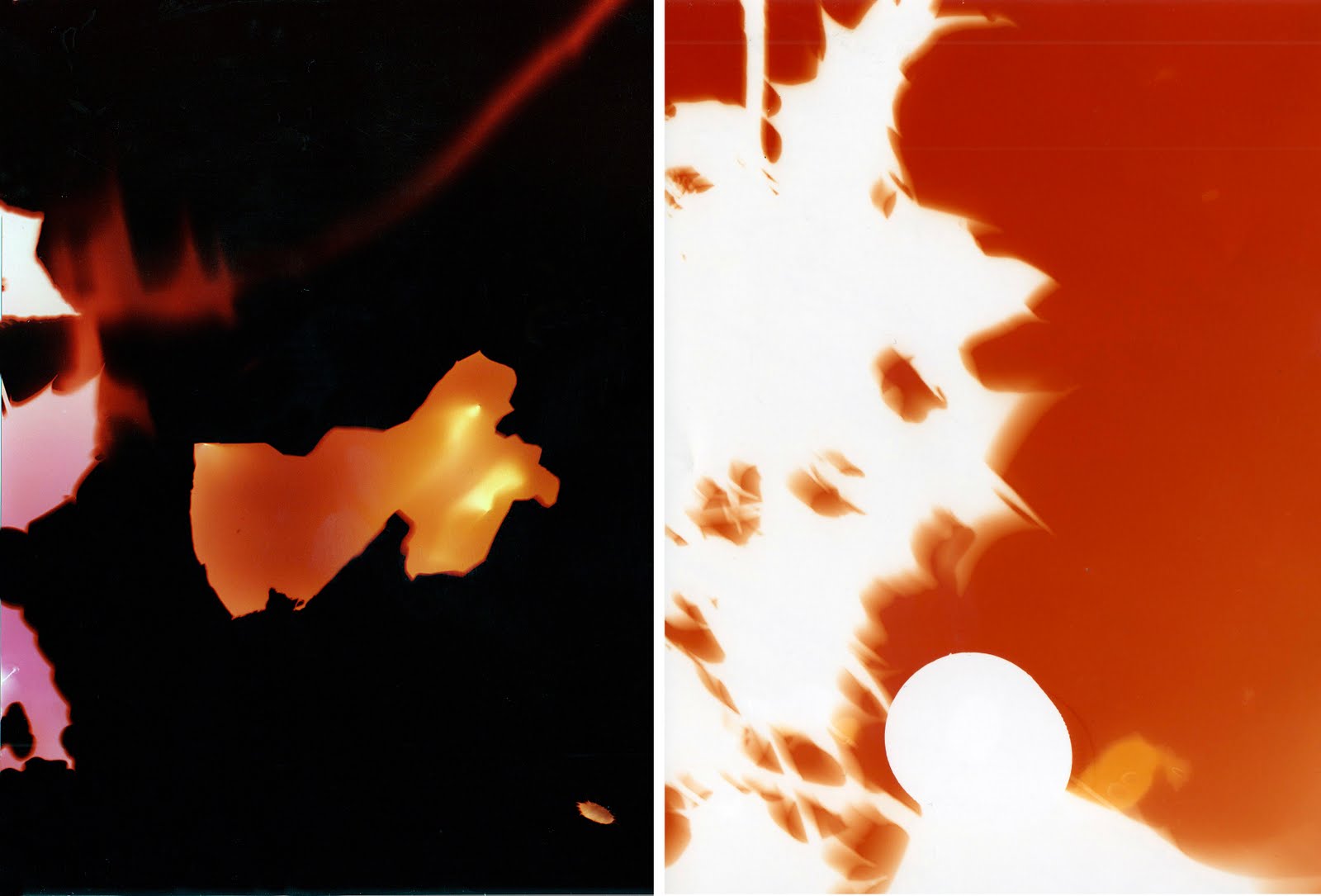
These two above were less successful as they don't have much texture like the other two, yet the shapes from the rubbish is a lot more apparent. However I do love the vibrant orange in both, the one on the left was over exposed as apart from where strong shadows fell, everything else is black.

Second Shoot

These photograms were taken at a slightly earlier time in the evening and therefore I think it was a little too light for the paper, whilst it has still achieved a lovely textured effect, I think the paper may have been slightly fogged which accounts for them all being tinted red, instead of getting lots of varied colours like the first experimentations.